Oct 1, 2026Buying Guides
Why Noodle Packaging Colours Can Match in One Light and Differ in Another
Understand a lighting-dependent mismatch between physical packaging samples and agree useful comparison conditions before print approval.
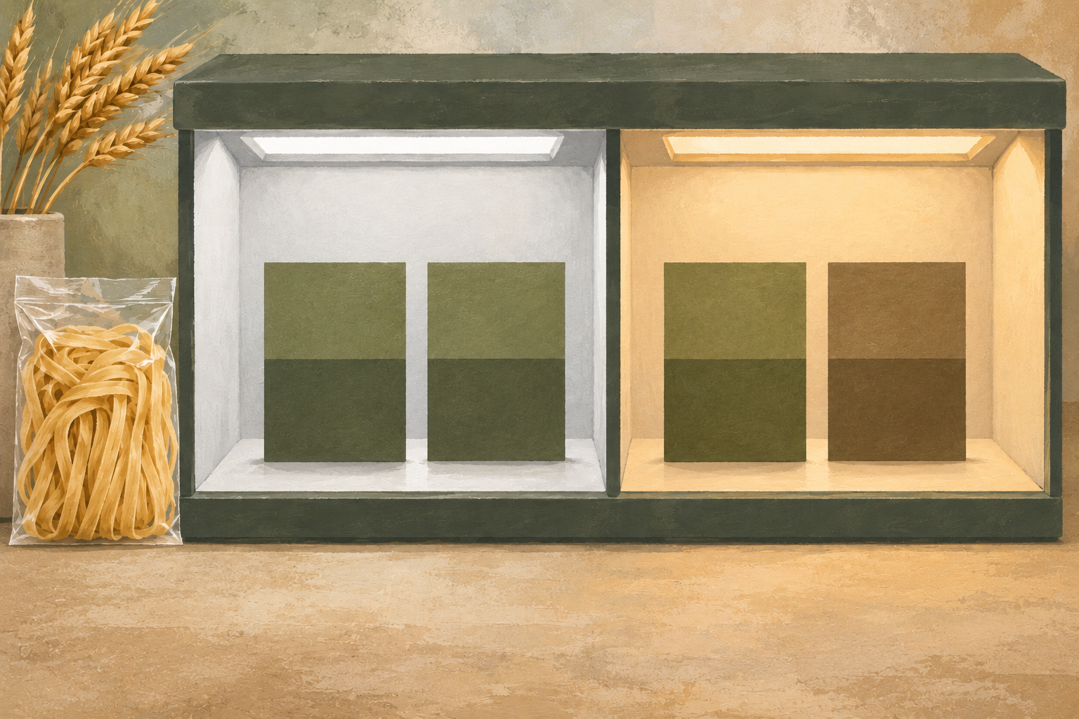
AI-generated editorial illustration of colour comparison under different lighting; not an actual facility, print defect or measured colour result.
Two physical packaging samples can appear to match under one light and differ under another. This can be metamerism: the pair produces a similar visual appearance in one lighting condition but a different relationship when the light changes.
For a private-label noodle buyer, the useful response is to agree how the physical reference and proposed print will be compared. Repeatedly editing a screen image does not resolve an unexplained difference between printed materials.
Check whether the problem is actually metamerism
Colour specialist X-Rite explains that materials can have different spectral responses while appearing to match under one light source. When the illumination changes, the match may disappear. It recommends assessing relevant lighting conditions when evaluating colour. X-Rite explanation of metamerism.
Not every packaging colour complaint is metamerism. If two prints differ under all the conditions examined, they may simply be a poor match. If only photographs or monitors differ, the problem may be image capture or display. First identify whether the concern exists in the physical samples themselves.
Compare a pair, not two memories
Use the approved physical reference and the proposed printed sample together. Record which two objects were compared, including their substrate and finish, rather than relying on “the green from the last order.”
For example, imagine a noodle pouch and its printed display carton seem consistent under the buyer’s office light but diverge under the intended store lighting. Their different materials make this a useful pair to investigate. This is an illustrative scenario, not a statement about a current product or a confirmed cause.
Ask the printer to help distinguish a lighting-dependent match from ordinary print variation. A photograph may help locate the disputed area, but camera processing and the recipient’s display mean it should not silently become the final physical colour reference.
Agree a useful comparison brief
The buyer and printer can keep a short brief containing:
- The physical reference identifier and the proposed sample identifier.
- The printed area or colour being evaluated.
- The relevant material, coating or finish.
- The agreed lighting conditions for comparison.
- The person responsible for accepting the result and any unresolved difference.
Where more than one lighting condition matters, name them before approval. Do not invent a universal numerical colour tolerance for every ink, material and viewing condition. If an instrument-based tolerance is required, agree the measurement method and conditions with the competent printing specialist as well.
Tie the answer to the physical version being ordered
Suppose the supplier later changes the substrate or finish. Retaining the same artwork file does not, on its own, answer whether the new physical print meets the previous colour expectation. Ask whether a fresh physical comparison is needed for the changed materials.
Keep an accepted sample or another mutually agreed controlled reference available to both parties. Record remaining differences explicitly. “Looks fine” without the compared objects or conditions is difficult to use when the next delivery is challenged.
The private-label artwork approval checklist covers version release and sign-off. This colour check addresses the separate reason that the same pair of physical prints can appear different when viewed elsewhere.
For an OEM noodle packaging project, send the chosen product, packaging format and reference materials through the contact page. Confirm which proofing and comparison arrangements are available for the actual order; this article does not claim that any particular colour-testing equipment is operated by Noodle House Food.
Reviewed: 1 October 2026. The example and comparison brief are editorial guidance for discussing print expectations.